Using the Binning Interval
Benefits of Binning Data
Binning reduces noise by grouping raw data points into sets (bins) based on a time interval, averaging the mean value of each data bin, then presenting the averages (mean values) on the graph. Binning takes into consideration all data points, but reduces the amount of data points presented to help the viewer make a higher-level interpretation.
Use Cases
More Clearly Showing Trends for CO2 and Humidity
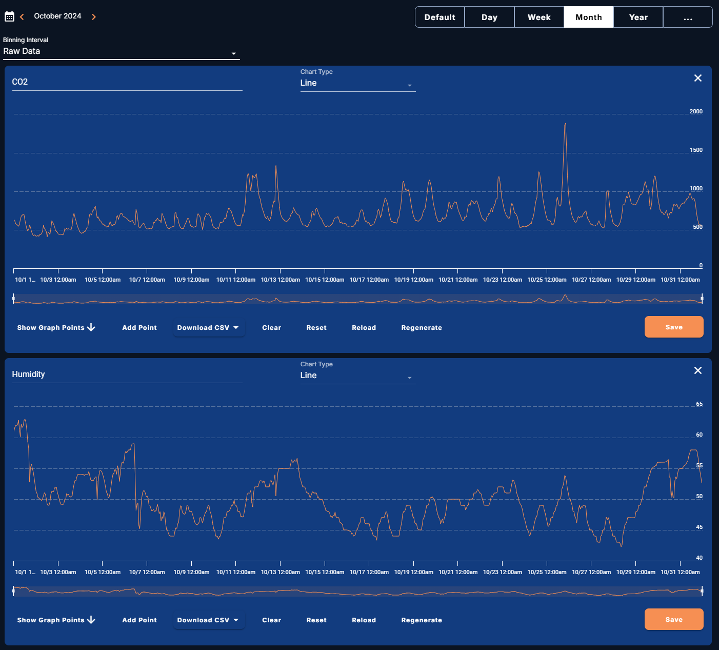
Figure 1 shows Raw Data for CO2 and humidity during October 2024. The line graphs based on the raw data show all the modulations throughout each day. A viewer must interpret the line graphs to understand the trends.
Figure 1
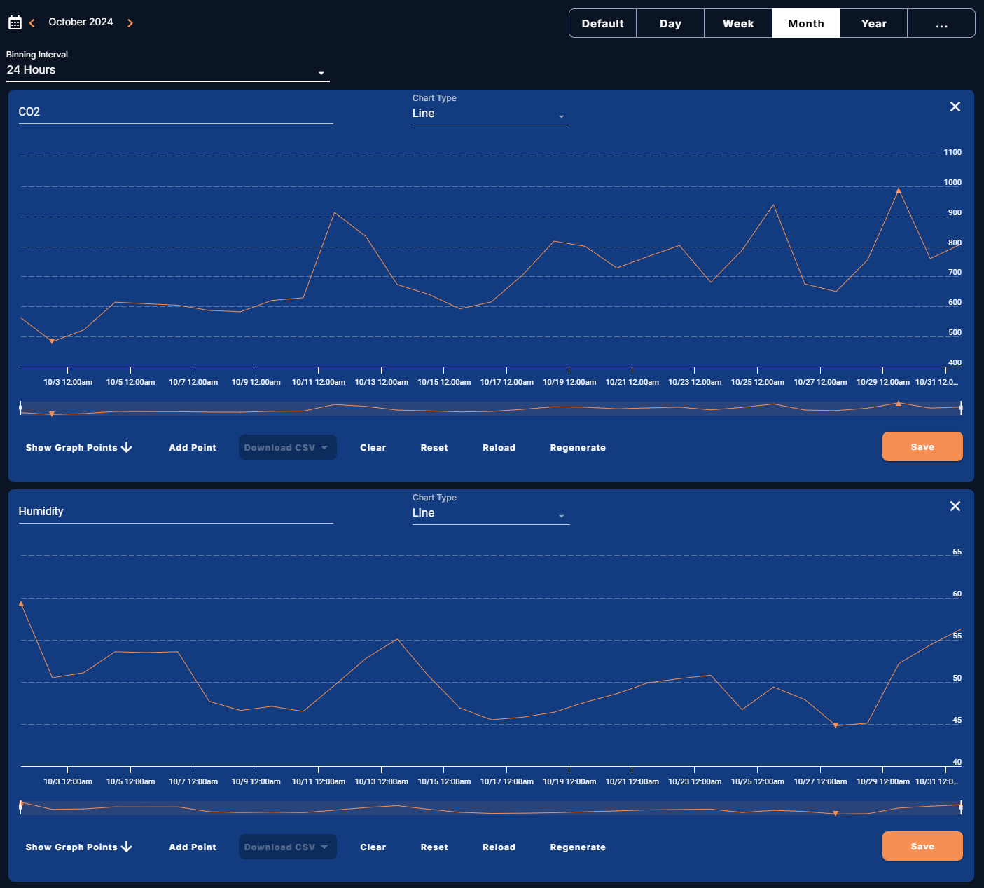
Figure 2 shows the data averaged at a Binning Interval of 24 Hours. The line graphs now present more pronounced and clear trends. A viewer can more clearly see:
-
an overall increase of CO2 during October
-
an overall decrease in humidity from October 1 to October 29
-
an increase in humidity in the last few days of the month
-
significant peaks in both CO2 and humidity occurring around October 11–14
Figure 2
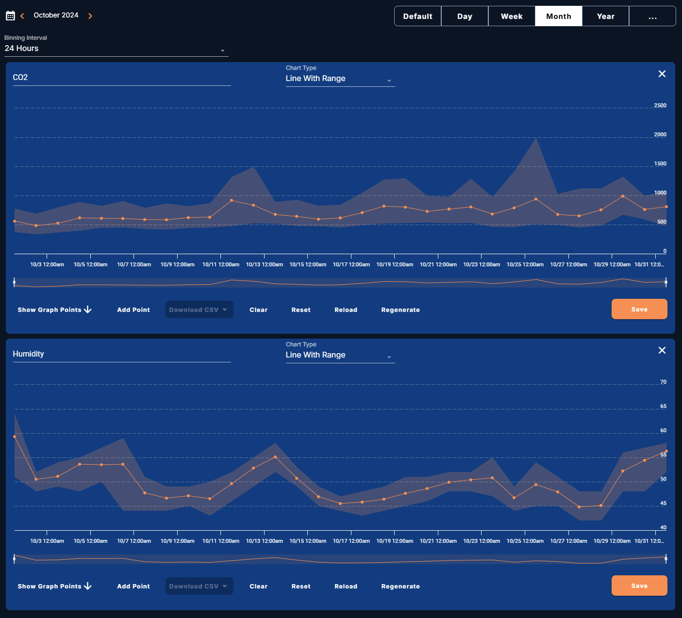
When the Binning Interval is set and the Chart Type is set to Line, the viewer can no longer see the amount of CO2 and humidity modulation each day. Setting the Chart Type to Line With Range provides this perspective—while keeping the focus on the daily averages—by displaying a shaded minimum and maximum value range behind the line (see Figure 3).
Figure 3 more clearly shows, based on the averages, that:
-
CO2 fluctuates more than humidity
-
humidity is more tightly controlled than CO2
Figure 3
From this binned Line With Range presentation of the data, facility management could determine to more tightly control CO2 to improve the indoor air quality. If a customer was concerned about humidity, the data would demonstrate that on average the space is staying within 40–60% with controlled modulation.


